In what ways does your media product use, develop or
challenge forms and conventions of real media products?
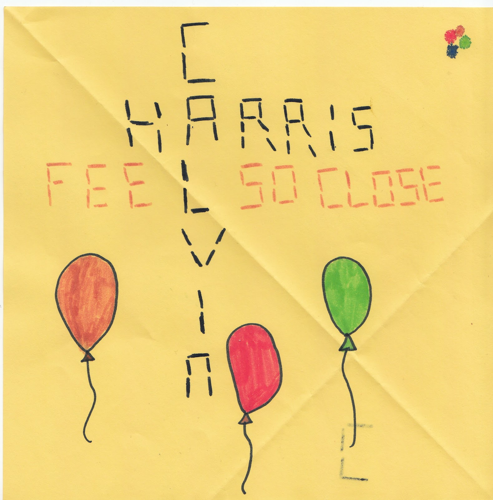
Our media product is mainly conceptually driven, however it does hold an element of narrative as despite not having one whole storyline there are a variety of stories within it. E.g. the relationship of the couple moving onto marriage, and the friends building their friendship.


We decided to challenge the typical forms and conventions of real media products by choosing this format of smaller stories within one, as a normal video containing narrative would have a continuous story throughout.
In terms of our style of
presentation, our media product deviated from the typical conventions you would
find simply because we wanted to show some versatility. We wanted to highlight
how not every dance/house track needed to include a club scene when the beat
dropped, and erotically dressed women dancing for men. We studied Laura
Mulvey’s theory of the Male Gaze and decided to slightly deviate from her idea that
females are shown as objects in the videos for our chosen genre of music. Despite slightly deviating we still showed the idea of sexy females but through our digipak and advert.


We decided to show a softer side to the genre and concentrated more on the lyrical side of the music. Despite this, when editing we concentrated on making the video fast paced to still reach out to the demographic we planned to reach out to.


Within our video our use of camera
follows the typical conventions you would find in a real music video. We looked
at Dyer’s Star Theory and found that a successful music video generally holds a
high percentage of shots of just the artist as this is what viewers are
expecting to see, we also looked at Goodwin's Theory on star image, the star image is another vital aspect of music videos. Because of this, we decided to include a lot of close up
shots within our video of us singing as we wanted to conform to these typical
conventions. In terms of editing we decided to follow the conventions as we
used fast paced cuts and creative ways to show our footage such as reversing
and speeding up, we also used split screen as a different way to
make our media product easier and more interesting for our audience to view. 
The reflective image of the females. We got inspiration from Beyonce's video 1+1 as you can see in the image below. We felt the idea of reflection had deeper meanings. It has links with water which was an idea we used in outrvideo because of the lyric 'surrounds me like a waterfall'.


We decided to show a softer side to the genre and concentrated more on the lyrical side of the music. Despite this, when editing we concentrated on making the video fast paced to still reach out to the demographic we planned to reach out to.

Highlighting the idea of friendship.

This image shows the loving side to a relationship, in contrast to most house music videos that concentrate on a more sexual side.

We took into consideration the lyrics as they played a big part on what we were trying to illustrate. For example on the lyrics “your love pours down on me, surrounds me like a waterfall”, we filmed myself behind glass with water pouring in front of my face to physically show what the lyrics were trying to portray.


This is also a metaphor for how water surrounds and protects human bodies as the love from the person would as well. Another way we used images to enhance the lyrics is with the words “I wear my heart upon my sleeve”, this is obviously a metaphor so we made this literal by using stop motion of a heart moving up someone’s arm and towards their heart. We wanted our video to have a lot of meaning and not to just by typical of what you would normally expect to see with our particular type of genre. This is one way we deviated from the conventions.
In terms of inter-textuality, we used other videos as inspiration for our own media product. For example Beyonce’s video of 1+1 is an extremely emotional video in which she is portraying her love for someone. As our video is all about showing your love for someone and wanting to be close to them this was a good video for us to get inspiration from. We looked at Andrew Goodwin's theory on music videos, he says that there are three ways in which music videos work to promote a song. One of these being that music videos can use a set of images to illustrate the meaning of lyrics and genre, which is the most common of most videos. The idea of the water coming down in front of my face was one cut from our video which shows how the visuals link to the lyrics. A second way we used inter-textuality was from Rihanna’s video ‘We found love’, the song portrays a similar message as that of ‘Feel so close’ so the song was a great source for us to get ideas from that we could use in our video. Most importantly it shows the couple and how in love they are with each other, this is the place we got our main idea from and it inspired us greatly.


We took a lot of ideas from the video as it was all about love just as our song was.
Question 2
How effective is
the combination of your main product and ancillary texts?
To effectively create an image that would be memorable to
the audience we used a number of different techniques to create memorable
images in the audience’s minds. With our video the use of colour was something
we used as a kind of motif so all of our forms of work would be recognisable to
potential buyers. We edited a piece of footage of Freya standing in front of
the green screen, to make it look as if the back ground was changing colour
whilst she was staying still, we also used the idea of bright colours with both
our CD Cover and also our advert for our album. The reason we chose colour was
to make our products stand out on the shelves if they were to be put into the shops
to be sold. It is scientifically proven that human vision is attracted to
brighter colours so this was something we took into consideration.


This is a screen shot form the making of our digipak, this is showing the making of our background. We got our idea if silhouettes and colours from the image below.

As you can see it is very similar to our final front cover of our digipak.

In terms of our digipak, we did a lot of research into what
kind of images are used on the covers of House/Dance Pop music.
In relation to inter-textuality the only inspiration for our
music video that we got was an image from google which we came across during
research. It was simply of four strips
of colour which immediately stood out on the page. As it grabbed our attention
so instantly we thought this would be a perfect image to grab the attention of
potential buyers. We needed to take into consideration how it would look on a
shelf along with other albums, as well as how good it looks on its own.
Despite our final decisions being as we wanted them to be we went through a long process to decide on how we wanted our final piece to look. Below are a few examples of practice CD Covers and Adverts.


Despite our final decisions being as we wanted them to be we went through a long process to decide on how we wanted our final piece to look. Below are a few examples of practice CD Covers and Adverts.


Question 3
What have you learnt from your audience feedback?
Audience feedback from our target demographic has played a huge part in the making of our video, without the feedback of our audience we would not have been able to progress our video to the stage that it is at now. To identify our target demographic it was necessary for us to look at what types of people listen to our genre of music and the ways in which they would appreciate viewing it. This all contributed to the way in which we created our music video and also how we created our other forms of media (advert and digipak).
We watched a variety of different videos, from the genre of House Music (Rihanna's 'We Found Love, and Calvin Harris' 'Bounce') which helped us to gain knowledge on what our demographic would be expecting and left us with the decision to either conform with, or deviate from these generic conventions. The first feedback I will be concentrating on is the feedback from the rough cut of our video which I have added a link to below. As it was our video, we found it difficult to see ways in which we could improve, however it is much easier for someone who is not in our group to give their opinion on what they think would work best.
Audience Feedback
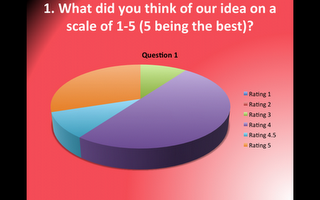


Above is a few examples our quantified feedback we decided to show it in pie chart form so it would be immediately clear to us on positive feedback or negative feedback.
The main things we gained from the feedback were that the club shots we used were too long and the amount we used was too much for the video and that some of the shots had little relevance. The way the audience said we could improve would be to redo the filming and change the camera angles; this would not be possible for us as we would have to get permission off of everyone we filmed which some people may not agree with. We took this idea on board and made our video more effective by removing the club footage as it didn’t have a lot of relevance to the other ideas we had and would be very difficult for us to re-film.
The first person said- "Cake fight looks better when close shots are used, maybe do it again with more variety"
The second person said- "Perhaps club shots last too long, get more because it is only one angle/thing"
The third person said- "Less shots of the club/party"
The fourth person said- "Bit too much of club. iPad idea was very clever"
The fifth person said- "I think you should use more close ups of the lips, the lip syncing was really good"
The sixth person said- "Add reference to the song, there's too many random ideas"
The seventh person said- "Mix up club shots with close ups of people in the club?"
The eighth person said- "Cake fight was better up close- too much club and a bit too random"
The ninth person said- "I don't really understand the concept iPad idea was good and footage of people walking"
The tenth person said- "Develop iPad idea- split screen- loose the club footage"

Above is a few examples our quantified feedback we decided to show it in pie chart form so it would be immediately clear to us on positive feedback or negative feedback.
The main things we gained from the feedback were that the club shots we used were too long and the amount we used was too much for the video and that some of the shots had little relevance. The way the audience said we could improve would be to redo the filming and change the camera angles; this would not be possible for us as we would have to get permission off of everyone we filmed which some people may not agree with. We took this idea on board and made our video more effective by removing the club footage as it didn’t have a lot of relevance to the other ideas we had and would be very difficult for us to re-film.
Another thing
we removed from the video was the cake fight idea; there was a lot of negative
feedback about the way in which it was shot and its relevance to the video. We
thought that it would be better to remove it and add in some ideas that we had
right at the beginning of the creation of our video (relationships).
Everyone
seemed to like our iPad ideas so we took this on board and developed the idea
by using split screen and having one screen smaller than the other so both
people could be seen. When we had changed it we asked a few people what they
thought and they told it it was very creative and much better than what it was
like before. We got the inspiration from a music video that someone created; below is a screen shot from this music video, next to an image from our music video. As you can see this images are very similar.


Another thing quite a lot of people commented on, which I have previously touched on, was the fact that some of the footage was irrelevant to what we were trying to put across. We cut down a lot of the footage to just show the relationships of different people. For example, we have shown the relationship of a couple and have tried to highlight that they are in love. We have also shown the relationship of two friends both of which are shown in different ways throughout the video.


Asking for feedback from individuals who matched our demographic, helped us to make sure our video was being improved for the better and not for the worse. The feedback has allowed us to improve our video vastly.
Question 4
How do you use new media technologies in the research, planning, construction and evaluation stages?
How do you use new media technologies in the research, planning, construction and evaluation stages?
During the making of our videos and we used a variety of different
technologies which enabled us to create the product in the way we wanted to
show it. For example we used, blogging websites, Photoshop, Final Cut, and
camera equipment.
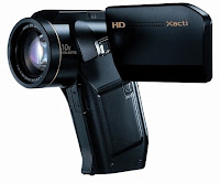
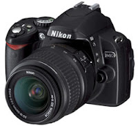
In terms of camera equipment we used a Sanyo HD camera for our videoing,
a Nikon D40 with automatic/manual focus for the stop motion and images for our
other products (CD cover and advert) and a tripod for both of these.
It took a while for us to master the controls of the Nikon camera but when I had learnt how to do this it was quite easy. One thing that was quite difficult to grasp was whether the camera was automatically focused or manually which obviously meant before each picture you had to check whether the image would come out focused or not. I spent a lot of time doing stop motion and this was a mistake I made. When I had finished taking the images, I looked through them and found that there were a few that were out of focus, luckily when I removed them it wasn’t obvious and the images still flowed nicely, so it meant it wasn’t necessary for me to start again. When I did the other pieces of stop motion that we used in our piece I made sure that I would learn from my mistake so I checked after each image I had taken to make sure it was in focus. It was a tedious task but was necessary for our end product to be effective and professional.


It took a while for us to master the controls of the Nikon camera but when I had learnt how to do this it was quite easy. One thing that was quite difficult to grasp was whether the camera was automatically focused or manually which obviously meant before each picture you had to check whether the image would come out focused or not. I spent a lot of time doing stop motion and this was a mistake I made. When I had finished taking the images, I looked through them and found that there were a few that were out of focus, luckily when I removed them it wasn’t obvious and the images still flowed nicely, so it meant it wasn’t necessary for me to start again. When I did the other pieces of stop motion that we used in our piece I made sure that I would learn from my mistake so I checked after each image I had taken to make sure it was in focus. It was a tedious task but was necessary for our end product to be effective and professional.
On shoot there weren’t many problems
that we faced but there were a few. On our first day of shooting we shot
footage outdoors of the balloons flying into the air and images of Ashley
throwing the bouquet behind her. We were filming in daylight outdoors so the
camera wasn’t reacting well to the bright light, as soon as we tilted the
camera to create a worm’s eye view of the sky, the footage just turned white. After
many attempts we found out that if we went closer to the door a shadow was
created so we could see the images much clearer. We picked this up so that for
any other times we were filming outside we could use the same principal to save
time.
The main piece of equipment that
helped me to generate ideas was the Nikon D40. By taking still images I was
able to think up ways in which I could create stop motion. The beginning of our
video is made up of stop motion images of paper looking as if it is moving by
itself. It was an extremely simple idea but the equipment made it extremely
easy to do and resulted in an interesting and effective end product.


We used a variety of editing software to enhance our media products including Adobe Photoshop and Final Cut Express. My group and I were mildly familiar with these programs so it made the progress of editing a lot faster and smoother.

Obviously there were things we needed to learn to be able to completed more complicated tasks but once we had learnt these we helped each other so we were all comfortable with working on the programs. We wanted the load of work to be spread between all of us so one person wasn’t in charge of one thing in particular. The only problem we faced with the software was that there were some techniques that we couldn’t figure out ourselves and therefore needed the help of others to do so. This was difficult because sometimes the help that we needed simply wasn’t available so this made the process slightly delayed. To overcome these situations we would concentrate on other pieces of work we could work on until someone was available to help.
In terms of camera and lighting in
the creating of our magazine advert and digipak there were a limited amount of
facilities but we made the most of what we had to work with. We had a green
screen and basic bounce light which we used to create the silhouette images
that we used on the advert and the digipak. It was crucial that we placed the
light in the correct place to make sure the light was equal on the green screen
otherwise this would cause difficulty when trying to edit the background.
Photoshop was an extremely useful
program when we were creating our products it allowed us to change and edit images
to illustrate what we were trying to get across to our target audience. Once we
had got used to the different tools and controls on the software we were able
to work at ease and complete necessary tasks.


Photoshop helped us to create the silhouettes that we needed to make for our CD Cover. We took normal images of ourselves and turned them into black silhouettes with the help of Photoshop. As you can see we used the green screen to make the editing of the image easier. The back ground being the same colour helps to bring ease to the cropping of the image. However the fact that my feet were not able to be on the green screen they were difficult to edit.
We faced a few technical challenges
during drafting for example when editing the silhouette images there were times
when we would cut them incorrectly so this resulted in us having to start again.
Despite this we kept the first drafts so we could show how we had improved.
In conclusion the
schools equipment allowed us to enhance and piece together our own ideas into
our music videos, digipaks and magazine adverts. Without the hardware and software we were able to access, our piece would not have been as advanced and realistic as it was able to be now.
No comments:
Post a Comment