Q1. In what
ways does your media product use, develop, or challenge forms and conventions
of real media products?
Our media
product is mainly conceptual although has an element of narrative. It does not conform to the typical forms and
conventions of the narrative style because although we do not have a fixed
storyline there are a number of stories within it. Our media product deviates
from established music video forms and conventions in some ways as we wanted it
to be different to the typical style of music video that people tend to watch but
also did not want to deviate too much to make sure that we were reaching out to
the right audience. The genre of our music video is dance/house, although we
have not stuck to the typical forms and conventions of a dance music video, as
people would expect there to be young people, at a club, drinking, with
provocatively dressed women, which diverges from Laura Mulvey’s theory of the
male gaze that we studied. The group and I wanted to have more than one
storyline throughout the video rather than a continuous storyline so that the
audience was kept interested and could relate to the different aspects of the
video.  In terms of
camera use, our video conforms to conventional codes and conventions as we have
stuck to Dyer’s star theory in a way that we have used various close-up shots
of the actors in our video as if they would be the main artist if our music
video was to be published. In terms of editing, we followed conventional codes
and conventions as we used fast paced cuts and creative ways to show our
footage such as reversing and a version of split screen where one screen
overlaps another screen and shows a different part of the video. We took the
lyrics of the song and metaphorically integrated it into our music video to
create imagery for the viewer. For example for the lyrics ‘Your love pours
down, surrounds me like a waterfall’, we filmed water pouring over Chloe to physically
show the lyrics to the viewer. We also used stop motion as a way of presenting
the lyrics, for example, the metaphor ‘I wear my heart upon my sleeve’, the
group and I used stop motion of two halves of a heart moving up the sleeve,
eventually forming a heartbeat. Although literally presenting the lyrics as
part of the video seems the obvious thing to do, you do not often see this in
music videos and we wanted to deviate aspects of our video from typical
expectations of the viewer.
In terms of
camera use, our video conforms to conventional codes and conventions as we have
stuck to Dyer’s star theory in a way that we have used various close-up shots
of the actors in our video as if they would be the main artist if our music
video was to be published. In terms of editing, we followed conventional codes
and conventions as we used fast paced cuts and creative ways to show our
footage such as reversing and a version of split screen where one screen
overlaps another screen and shows a different part of the video. We took the
lyrics of the song and metaphorically integrated it into our music video to
create imagery for the viewer. For example for the lyrics ‘Your love pours
down, surrounds me like a waterfall’, we filmed water pouring over Chloe to physically
show the lyrics to the viewer. We also used stop motion as a way of presenting
the lyrics, for example, the metaphor ‘I wear my heart upon my sleeve’, the
group and I used stop motion of two halves of a heart moving up the sleeve,
eventually forming a heartbeat. Although literally presenting the lyrics as
part of the video seems the obvious thing to do, you do not often see this in
music videos and we wanted to deviate aspects of our video from typical
expectations of the viewer. 


As research into music video's, we were asked to produce various essay's analysing different music videos. We were also asked to produce an essay based on a music video director. In each of the essays, we had to discuss Goodwins theory and how it is presented in music videos. As a result of producing these essays, it gave the group and I and insight into what music videos should consist of. For example; star image motifs, the relationship between music and visuals etc.
Please can you look at my Wix website for question 1
http://www.wix.com/ashleekatestump/ashleysmediaevaluation#!question-1
Q2- How effective is the combination of your main product and ancillary texts?
In our
music video, the group and I developed a number of branding elements. Branding is a name, symbol or image that is commonly known to identify a company or its products and seperate them from competition. Branding is important as it makes the product indentifiable to the intended audience which create a feeling of imvolvement. One
branding element that we created was the silhouette figures on the couple Jack
and Sarah. Another branding element that
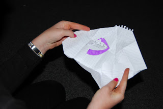
we developed in the music video was the split screen of each of our lips. Both
of these elements have been followed through on.


We researched into magazine adverts and various digi-packs in order to get a better understanding of the sort of things that should be included when creating an advert of digi-pack. We were asked to analyse some Digi-packs and a magazine advert in detail which helped us when creating our own because we knew what type of things would be expected by the audience. We also learned that the advert and digi-pack needed to be easily identifiable to the intended audience. As well as analysing adverts and digi-packs, we also produced some rough drafts of our own CD covers and adverts.


We researched into magazine adverts and various digi-packs in order to get a better understanding of the sort of things that should be included when creating an advert of digi-pack. We were asked to analyse some Digi-packs and a magazine advert in detail which helped us when creating our own because we knew what type of things would be expected by the audience. We also learned that the advert and digi-pack needed to be easily identifiable to the intended audience. As well as analysing adverts and digi-packs, we also produced some rough drafts of our own CD covers and adverts.


First of
all we created the digi-pack and in order to make it as realistic as possible,
we had to include the traditional forms and conventions of an album cover and
digi-pack. These elements include soundtracks on the album, artists name,
copyright information, background image as well as a continuous theme
throughout. The branding elements of the digi-pack are the stripy background,
which is consistant on the album cover and back of the album cover as well as on
the magazine advert, and the split screen image of the groups lips. We also
used the same font that Calvin Harris uses for his ‘feels so close’ single,
Helvetica, which makes the digi-pack more realistic.

This is the inside to our digi-pack.

This is the outside to our digi-pack.
For our magazine advert, we decided that we wanted to stick to the same theme of the digi-pack as well as sticking to the forms and conventions of a magazine advert; title, artists name, release date, reviews, star rating, copyright information etc. As in our digi-pack, we have stuck to the same stripy background for the magazine advert, the silhouette figures and Helvetica font. This makes the magazine advert more easily recognisable and the audience will recognise the artist when seeing the advert. The stripy background makes the advert bold and stand out and the silhouette relates back to our music video.

This is the magazine advert.


These are the stages of making the silhouette pictures for our digi-pack and magazine advert.

Overall, the group and I have tried to stick to the typical forms and conventions of a music video and the advertising that goes with it. We also tried to stick to the same theme throughout to make our advertisements more easily recognisable for the audience.
Please can you see my Question 2 on my wix website.
http://www.wix.com/ashleekatestump/ashleysmediaevaluation#!question-2
Q3.
What have you learned from your audience feedback?
The target demographic of our music video is both males
and females between the ages of 14-21. We took ideas from Rihanna’s video ‘We
found love’ and Beyoncé’s video 1+1 as part of our research into our target demographic as the two videos are the same genre as our music video.


As part of our research, we looked into various music channels and their viewing figures:
MTV Dance- Daily- 109,000, Weekly- 548,000
MTV Hits- Daily-300,000, Weekly- 1,518, 000
Kiss-Daily- 194,000, Weekly- 929,000
Viva-Daily- 975,000, Weekly- 4,173,000
Smash hits- Daily-161,000, Weekly- 868,000
We also looked into the different types of record labels that would be likely to sell our album; Fly Eye, Columbia, Ministry of Sound, Armada Music and Tiger Records.


1. Club shots last too long, perhaps take them out or shorten them
2. I like the iPad idea and the different background drop you used
3. Add referece to the song. There is too many random ideas
4. Cake fight could be cut down
5. I do not really understand what is going on. There is not one main storyline
6. A split screen would be a good idea to use for the iPad idea.

Regarding
the digi-pack, everybody liked the colour scheme idea of the 4 different
coloured stripes but really liked the silhouette idea because it was very
different to what they expected. They liked the fact that we added elements of
our music video to our digi-pack as it is easy recognisable. They liked that we
kept the font as Helvetica which is the actual font that Calvin Harris uses for
his ‘feels so close’ single. For the magazine advert, the audience feedback
revealed that they liked that we stuck to the colour scheme of the digi-pack
and the silhouette figures as people would be able to relate to the music video
easily.


Audience feedback from our target demographic has helped greatly towards the making of our video. The comments we received from our target demographic let us know what we were lacking in our video as well as what should be kept. To identify our target demographic, we looked into the types of people who listen to our genre of music and their expectations of what should be included in a dance/house genre.

We decided that we wanted our background to be multi coloured in order for the silhouette figures to stand
out. To
create the muliti-coloured effect I opened a blank document on photoshop, used
the rectangular marquee tool and selected a square block on the black sheet.

Once this was done, I selected 2
colours using the colour picker, one lighter than the other one, and then used
the gradient tool to have the top darker than the bottom. This effect will make
the silhouette figures at the bottom stand out more than it would if the
background was one block of colour.

I repeated this 3 times for all the different colours.

Then I started to add text, but we changed it last minute to white text, Helvetica font.
I think our end products are successful and stands up against professional
products as they are eye catching, well recognisable, well edited and
believable. I think the video conforms to genre codes and conventions
throughout. We used a variety of shot sizes and paid close attention to
mise-en-scene. Our digi-pack and magazine advert both look realistic. This was
achieved by showing understanding of conventions of conventions of layout and
page design, accurate use of language and register, appropriately integrating
illustration and text and so on. We all worked equally within the group and
helped each other when needed which was a big help in making the end products
successful.
The music video is a must-see-again video, I think, because there are a lot of different elements in the video the viewer may want to watch over and over again to consume all the different elements. I think our music video would be promoted by a major record label as Calvin Harris is a well known artist. Our music video’s unique selling point would be the silhouette figures , the four different coloured lips and the stripy background as it is on both the digi pack and the magazine advert. I think this could provide some opportunities for spin-off merchandising such as personalised t-shirts, mugs, wall posters, key rings etc.
Please can you see my Question 3 on my Wix website.
http://www.wix.com/ashleekatestump/ashleysmediaevaluation#!question-3
Q4- How did you use new media technologies in the research, planning, construction and evaluation stages?
Whilst
creating all of our media products, there was a range of technologies that we
used in order to help us do this in an effective and professional way.
Research
was a huge part of our coursework and technologies such as Web 2.0 helped us
greatly. Using Web 2.0, we were able to use Google and YouTube to help with
researching other music videos, Calvin Harris, genre etc. The Mac computers
helped a lot in the production of our various products as its big screen and
ability to adjust contrast and colour made it easier for us to see what we was
going in a way that suited us. We also used Blogger to present the work we had
done as well as to show progress.
For filming
our music video, we used a Sanyo HD camera. As the camera was HD, it made the
overall quality of the footage better which meant that the finished product
looked more professional. Last year, we used a different camera, so we had to
take some time to learn how to use the new ones. We learned that we had to make
sure the white balance was correct before filming. To do this we simply zooming
into a white piece of paper/ white object and clicking correct. Compared to
last years cameras they are much better quality and more reliable to use. The
only problem we faced with the camera was lighting. For part of our music
video, we had to film balloons being set off into the sky, but because the sky
was too bright, the camera did not pick up the floating balloons as well as it
should. We tried different settings but nothing seemed to work. We waited till
the sky got a bit darker and filmed again and the camera managed to pick up the
balloons more clearly. We also used a
tripod during filming to help keep the camera still. The tripod was also useful
for panning, tilting and changing height which helped to make the video seem
more professional. Lighting was a big problem in our video which meant that we
had to compromise with some parts of our video. We wanted to have a club scene
in the video, but due to poor lighting this was not possible. We then had to
take that idea out and replace it with something better.


When
creating our digi-pack and magazine advert, we used a Nikon D40 still camera to
take pictures in order to eventually create a silhouette figures and also for the stop motion we use in the video. The Nikon D40
allowed us to produce high quality pictures to help make our advert and
digi-pack seem more proficient and realistic. We also used a green-screen to
help create the silhouette effect. The green screen helped when coming to edit
the pictures as it was easy to take out the background. We also used the green
screen for stop motion in our video. We
took various pictures of Freya in front of the green screen with paper hearts
moving up her arms, reflecting lyrics in the song, and edited the green screen
on Final Cut to have a flashing background of various colours.


When coming to
edit the pictures, we used Adobe Fireworks and Adobe Photoshop. As I have used
both editing suites before, I knew how to use them well which meant I did not
need to waste time learning how to use the software. The only technical
challenge I faced was creating the silhouette effect. So I took an image and
took time going through the tools on Photoshop and figured out how to create
the effect. Once I knew how to do this, I applied what I had learned to the
picture we took to use for our digi-pack and magazine advert.

(Example of
editing on Photoshop)
For the editing of our video, we used Final Cut Express. I had not used Final cut before this project as last year, I used IMovie. I took some time out to learn how to use the editing software. The class was given a ‘Pink Panther’ task to do which meant that I got a chance to use the software and learn the basics. The only problem we faced with Final Cut was when we placed new footage into the software, the whole video would move about meaning that we had to move it back again. We also used garage band briefly to cut down the length of our song. We had used Garage band before so it did not take us long and we did not face any difficulties


Overall,
all the technologies listed have been a huge help for my group and I in our
project and has helped us to create products at a professional standard in
order to make the products believable.
Please can you see my Question 4 on my Wix website
http://www.wix.com/ashleekatestump/ashleysmediaevaluation#!question-4
Please can you see my Question 4 on my Wix website
http://www.wix.com/ashleekatestump/ashleysmediaevaluation#!question-4
No comments:
Post a Comment