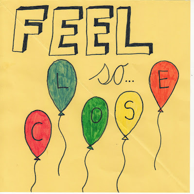
As a group we decided that we wanted to incorporate the idea of having the main part of our front cover as an idea from the video itself. This is the reason we have chosen to add in the images of the balloons as this is a main theme of the video and will help viewers to make a correlation between video and album.

The one below is an idea that I thought of personally which is how someone can have different personalities within themselves which make them who they are, hence the reason i made the face from different pieces of people's skin and different eyes, noses, and mouths. I wanted to keep some of the same elements of the video so that is why I added the images of the balloons and cake.
The idea below was by Ashley she thought we could have the name of the album in bold with images from the video placed inside so it would give an insight to the video before actually being able to view it.
The idea below is again one of Ashley's ideas she thought we could incorporate our idea of bringing people together by including images of different people in different squares on the top of the CD cover. Then she thought we could include images of our footage on the bottom part of the CD, with the text of the album name and artist below. This is a way of again linking the video to the cover.
The CD cover below is another one of Ashley's ideas. She noticed that the letters can be used to fit together so she used the font that Calvin Harris has previously used in his own covers so there is a link there. Also she incorporated the idea of the balloons that we use in our video.
The below test CD cover is one I personally don't think works for our music video as it has no correlation with our video. We just created it as it looked quite effective but I think a lot of our other ideas would work better with what we are trying to put across.


No comments:
Post a Comment